Wednesday 6th September 2023
Introduction to media representations
LO: To explore the concept of representation and stereotypes.
representation
The media offers us a particular view of the world and their interpretation of the world
It is a RE PRESENTATION of the events, people and places.
in the advert the word superhumans has a positive effect beacuse by calling disabled people superhumans this is indicating that they think they are better than regular humans and the word superhuman correlates to the word superhero, and seeing as people think superheroes are better than humans indicating that the people who have made the advert think that these superhumans are more incredible than normal humans.
i think there is a negative reason as to why this is also negative, because they are calling these disabled people superhumans which could also mean that they are portrayed as different from the 'normal' people.
strong
brave
resilient
friday 8th september 2023
nanny: Old, acts like an old timer, female, ancient and decrepit
Nurse: woman
teenager: Depressed, wears hoodies alot
Astronaut: male, floating
Football player: Football boots, shorts and t-shirt
Opera Fan: posh, loves classic music
teacher: Miss Mac, old
Tattoo lover: covered in tattoos, edgy
this adverts challenge stereotypes because nurses are proclaimed as women and this ad is asking men if they are man enough to be a nurse.
educating the east end
students messing around- srudents having fun
teachers making fun of students- teachers getting along with students
Wednesday 13th September 2023
Representation in magazines
LO: to explore the representations found in magazines.
direct address- when the model is looking directly at the camera
puff- the circles that look like stickers on the magazine
cosmopoitan:
target audience: females
cover 1: inexperienced, pregnant, relaxed
cover 2: powerful, succesful, elegant
cover 3: fancy, rich, royal
on edge, confused, weirded out
friday 19th spetember 2023
ones male ones a girl it matches the target audience
one is pink the other is black in the background
different target audience
ones about a guy one is about a girl
the female gender is being represented as young, pretty, a modle
where as male is presented as weathly, physically fit, posh
- the cosmopolittan one is quite girly where as the gq is quite manly even though the cosmopolitan one is a guy and the gq a girl
- one is a mythological being
- she has been sexual objectified on a man magazine
- the cosmopolitan guy could be gay as he is wearing feminine clothing
- the cosmopolitan one looks like very seasonal clothing for women
Wednesday 20th September 2023
Exam style magazine question
LO: To write and structure an effective exam style answer
The two covers represent gender very differently Cosmopolitan represents Tom Daley in an stereotypical way. For example he has been dressed in more feminine clothing- both in colour and style. However as a gay man this is more stereotypical. On the other hand, there are more stereotypically masculine representations with the tattoo as most men are depicted with getting tattoos, and the muscular physique.
GQ also represents Rhianna in a stereotypical way. For example she is naked in the front cover this therefore means she is being sexually objectified on the front cover of a mens magazine as she is naked. Rhianna is also portrayed as the medusa on the front cover of this magazine which Medusa is a mythological being. Which she is also conotating that she is appointed as being scary.
Both of the front covers use the opposite gender for both the magazine target audiences. For both genders they are both creating features of that target audiences gender.

Wednesday27th September 2023
Friday 29th September 2023
Exam style magazine question
LO: To review and improve an effective exam style answer.
MAG REPRESENTATION EXAM Q:
A good start.
WWW: you've compared both covers and included gender stereotypes
EBI: include more specific media terminology in your examples
Industry Research
LO: To research companies linked to set products
GQ:
Launched: 1957
Original genre/ target audience: Men
has it changed, rebranded at all over the years? The magazine continues to evolve with an online version at gq.com, a strong social media presence, unique video programming, and tent-pole events, including the iconic British GQ Men of Year Awards which reaches a global audience.
Who publishes it? Condè Nast
is it print only or multi platform? Gq is a multiplatform brand.
average circulation: 89,072
average readership: 400,000 monthly
target audience: Men
Summarise brand image:
Tagline: 'loo sharp, live smart'
Ideologies: Men's Fashion, Style, Grooming, Fitness, Lifestyle, News & Politics
topics covered: The lifestyle magazine is an influential mix of award-winning writing and photography aimed at image-conscious young men who are interested in fashion, culture, entertainment, sport, and relationships.
Style: premier men's magazine.
Wednesday 4th October 2023
Circulation-a count of how many copies of a particular publication are distributed.
Advertising revenue- Advertising revenue is the monetary income that individuals and businesses earn from displaying paid advertisements on their websites, social media channels, or other platforms surrounding their internet-based content.
Cover price- cover price (plural cover prices) (publishing) The price of a publication, such as a book, newspaper or magazine, traditionally shown on the cover.
Subscription model- If a magazine company offers a monthly magazine service, instead of as a single magazine purchase, it offers its service as a 12-month service comprising 12 purchases. This makes the revenue model of the company stronger because it guarantees itself sales over a 12-month period rather than a single purchase.
Multi-platform- compatible with or involving more than one type of computer or operating system.
"a multiplatform software package"
Readership- the readers of a newspaper, magazine, or book regarded collectively. "the magazine has a readership of just 65,000"
Ideology- a system of ideas and ideals, especially one which forms the basis of economic or political theory and policy.
Brand identity- Brand identity is the visible elements of a brand, such as color, design, and logo, that identify and distinguish the brand in consumers'
Target audience- a particular group at which a product such as a film or advertisement is aimed.
"his stated target audience is children
Vogue:
Launched:1916
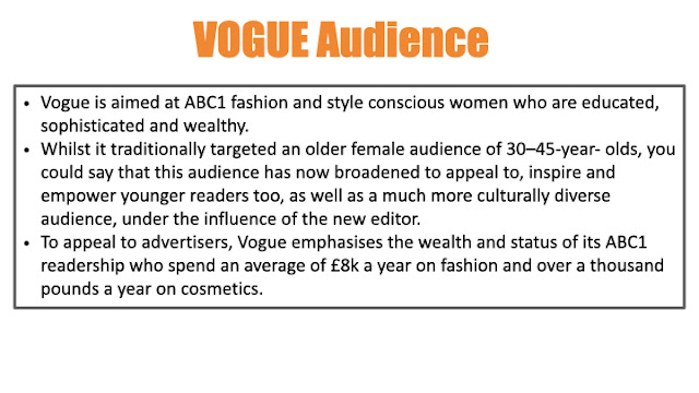
Genre/target audience: female fashion
Has it changed, rebranded at all over the years? Became one of the firsst to have a colour photo on the front page of the magazine.
Who publishes it? Enninful
Is it print only or multi-platform? Print only
average circulation and readership? circulation: 190,249 Readership: 796,000
target audience: Women (17-29 year olds)
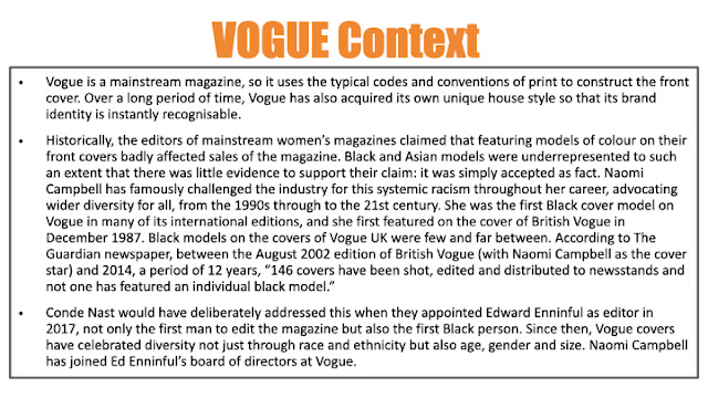
summarise brand image: Vogue has enjoyed international success, with both standard and special editions published around the globe. One of the world's most prominent fashion magazines, it has heavily influenced the development of the fashion magazine industry and continues to shape modern fashion trends.
Ideology: The ideology is materialism represented to us, by using perfect images that people enjoy and that create an ideal of lifestyle. The ideology of Vogue is that the magazine is representing a sophisticated lifestyle. Very important is fashion, exclusivity, reaching a higher class and beauty.
Topics covered: Vogue (stylized in all caps) is an American monthly fashion and lifestyle magazine that covers various topics, including haute couture fashion, beauty, culture, living, and runway.
Friday 6th October 2023
Homework:
How GQ represents gender on its front covers may vary from issue to issue and over time, as it reflects the evolving cultural and societal perspectives on gender. The magazine is also saying that Chris Pratt is the 'man of the year' this means that the designation "Man of the Year" typically refers to an annual recognition given by various organizations and publications, including GQ, to an individual who is deemed to have had a significant and positive impact on society or culture during a specific year. Historically, this title has often been given to men who have achieved notable accomplishments or milestones in their respective fields However, in recent years, there has been a growing awareness of the need to be more inclusive and considerate of gender diversity. As a result, some publications and organizations have modified the language they use for such awards to be more inclusive and reflective of a broader range of gender identities and expressions. For example, some publications now use terms like "Person of the Year" or "Individual of the Year" instead of "Man of the Year" to be more gender-neutral and inclusive. This change acknowledges that individuals of all genders can make significant contributions to society and culture. The specific terminology used may vary between organizations and publications, and it's important to check the wording they use in their announcements and award titles to understand their approach to gender inclusivity in these designations.
Wednesday 11th October 2023
Do now
GQ: Male brand, classy, stylish
Vogue: Feminine, fashion, empowering
Case Study 1: Raheem Sterling GQ
LO: to explore the context and cover star for case study 1.
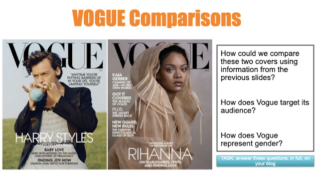
We can compare these 2 covers by saying that most men on the gq cover is usually a close to mid shot and most women usually show there full bodys, we very rarely see a flul mens body on gq.
gq targets its audience by having lots of stuff that would draw the average mans attention to the front cover and it also mainly talks about sports and how to look good as a middle aged man.
GQ represents gender by sexually objectifying women on their front cover where as on the other hand men are usually portrayed
Homewok
find out 5 facts about raheem sterling
he had a tough childhood and grew up in london
he has 3 kids
he currently plays for chelsea after his move from manchester city
he moved to london from jamaica
bonous point for any articles you find!
Friday 13th October 2023
typography
shape of text, style, block capitals/lower case,colour,italics
The made the main cover line a different font so it shows the reader what actually is the main cover line
and so it stands out and connected to the main image on the front cover.
Colour palette:
Grey, black and white. Accent colour is beige.
the colour can link to the main cover line seeing as most rock n roll stars wear black colours and it is
shown on the front cover with him wearing black and the main cover line has links to rock n roll.
Layout
Most magazines either hav an L or a Z shape on there front cover connecting cover lines, this means that
other text makes a Z like shape from top to bottom or an L shape with all of the text on one side with a
few going across the bottom.
Anchorage text
The text is describing who is on the front cover, this is shown when it says rock n roll star, this indicates
that the front cover is a rock n roll star.
Image
They are using a close up shot for Liam Gallagher to show us that he is potentially a rock star because
most rockstars, when they have photos taken they have the camera light emanating from the glasses
this is potentially to prove that they are under the spotlight.
Wednesday 1st November 2023
he has bandages around his hands which indicate he could be a fighter.
hes sat in a boxing ring which could mean he is a boxer of some sort.
his face looks serious which means he does something very seriously.
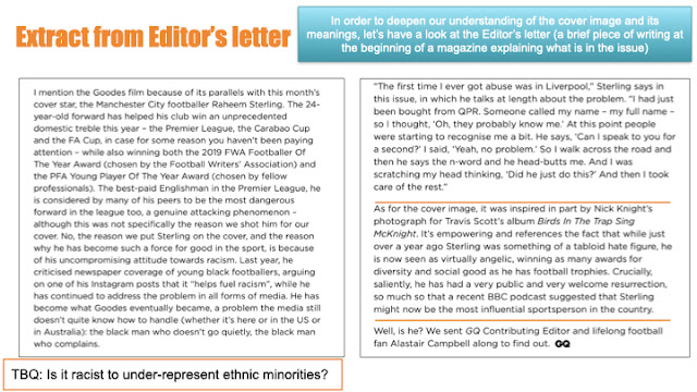
Raheem Sterling MBE is an English professional footballer who plays as a winger for english club
Chelsea and the english national team. Born in jamaica to jamaican parents, Sterling moved
to London.
Summary
In 2018, the footballing star raheem sterling, spoke out against racism after a previous match
against Chelsea when he was still playing for Manchester City. During this match, Sterling had racial abuse yelled at him by the Chelsea fans as he was going to collect the ball. Sterling had this statement relating to racism in late 2018 around December time in regards to how he felt to the racial comments being shouted at him at that match by saying that the media doesnt help with the racism during football matches to other black players/ other ethnicities besides white people.

Anchorage text:
He is a winger is the reason he is seen as an angel because he has wings and play son the wings in football
He protects other black people
seen as the bad guy on the media but in reality he is a nice person.
A Z pattern on the front cover of the magazine.
Friday 3rd November 2023
Explore how this front cover of gq magazine uses media language to communicate meanings:
Images
Text/ written language
layout and design
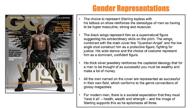
This front cover of GQ magazine uses media languages to communicate many different meanings, for example the main cover image represents Raheem Sterling as an angel, this is indicated with the dark wings that the editor of the front cover has given Sterling, however the editor has given Sterling dark angel wings instead of the usual light coloured wings most people represent an angel would normally has, this could indicate the anti racism campaign he had run in recent years, the reason he would start this campaign is to stop the racial abuse him and his teammates had been yelled at. The anchorage text used on the front cover also has direct address towards Sterling. He also has a wide legged stance on this front cover which also indicates that he is confident and could also possible show that he has lots of power and it also shows he is confident in himself, we can prove this by how he is standing and also how he is dressed, he is dressed without a top showing his tattoos which is often referred to with power and he seems quite confident in showing them off and he is also confident with showing off his physique. The main cover line, which states 'Guardian Angel' which is also in gold and has a serif typography emphasises Sterlings place in the footballing world, however this could also have religious connotations. The cover line 'speak no evil' could be a reference to the racial slurs Sterling and other black/ other ethnic footballers had been yelled abuse too during matches when the opposing team would scream abuse towards these kinds of players, simply because the opposing side had been losing. The colour palette on this front cover which include, black, gold, white and orange can show contrast and represent good vs evil. In this front cover Sterling is also shown with lots of expensive looking jewellery which could be a reference to show his wealth and possibly how wealthy Sterling is. The GQ masthead is featured in the top left hand corner of this front cover in bold, it is also using a sans serif, and is also featured in gold writing this could have connotations of the religion Sterling is involved in but it could also indicate the vast amount of wealth Sterling has. This could also be an indication to Sterlings status as the highest paid football star and the way it could link to religion is with the cross on Sterlings chest, which could be an indicator to what religion he is apart of. By also representing and calling Sterling a 'Guardian angel' could be a reference to how he protected the other black english players having racial abuse at the time before he started his campaign to stop racial abuse to other ethnic footballers after his past recollections of racial abuse similar to the Manchester city versus Chelsea game in December 2018.
Wednesday 8th November 2023
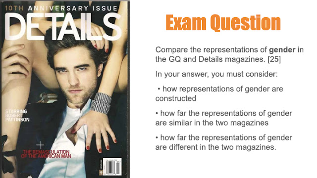
he is being represented as sterotypically muscly
the camera is angled at a low point of view which could indicate that he is powerful sterotypically.

physically strong
looks intimidating
Friday 10th November 2023DO NOWMasculine
Powerful
Intimidating
 HOMEWORK
Friday 17th November 2023
Paragraph summary malala
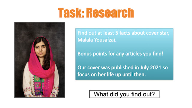
what we know of so far is that malala has been shot in the head for simply attending school. Surprisingly she had survived this gun shot, which were very slim odds, the reason she had been shot was because she opposed Talibans restricitons. She also achieved a nobel peace prize because of this revolution and also because she made a campaign for girls education.


On this Vogue front cover the editor is using a medium close up which is different compared to the
other front covers of this brand. They are also using direct address to show how confident Malala is in this front cover. There is also a lot of emphasis on her face which is where she had been shot and the reason she started the girls education campaign in the first place. Malala in this front cover is also wearing red. This could be an identification of blood when she had been shot in the head and survived.
Her hand jewellery could also be a tie back to her wealth and could mean she is quite wealthy and could afford lots of expensive accessories such as rings, necklaces etc. The colour palette on this front cover is very red which could also refer back to when she had been shot in the head, this is also evident when it says that she is a survivor as she had survived being shot to the head when she was 15. This leads her to go on campaigns about girls education to have freedom which also had led to her success, linking back to her jewellery and wealth and also fame. She is greatly known across the world as a survivor and inspiration across everyone. Her clothes she is wearing could also be linked to her religion muslim. This is why she wears a hijab on the front cover because muslims often wear hijabs everywhere they go as it is apart of their religious ways. The caption of Malalas name is the brightest thing on the front cover and also contrasts well with the red colour, however the red background brings out the colour of the caption of her name more than the other cover lines. The layout of the front cover represents a Z shape, similar to other front covers.
Wednesday 22nd November 2023
Do now
There is a lot of emphasis on her face, this is the reason she started a campaign because she had been shot in the head and had survived.
Her head scarf could be a representation of her religion
She is wearing jewellery which indicates her wealth
Vogue has gotten a lot more diverse ever the years, wether it be body size, ethnicity, racial, age. Especially before 2017, Vogue UK had gone 14 years with only 6 non white solo cover artists.
We can see diversity by how many times Vogue uses non white cover star.
Malala is represented as anti-stereotypical bc she is presented as very confident by using direct address where as the stereotype of a muslim is quite secretive.
Being female is represented as confident which is a typical stereotype for a female only magazine, the cover lines are similar to what a female likes to read or watch. This is stuff like love and romance and fashion.
malala looks very feminine, flowing silk headdress, jewellery, make up.
Classy and sophisticated- colour image and pallete
Sterotypically female- concerned with fashion
Fighting talk cover line- challenges stereotypes.
Malala anchorage- Depicts how string she is
The word survivor- anti-stereotypical.
DEL: Describe - technique/element/representation
Explain: Connotations/ meanings constructed
Link: The overall context/ meaning.
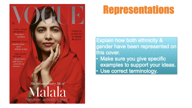
In this front cover the editor is using direct address and telling Malala to look directly at the camera, this
is to show the reader how confident she is and represents she is very powerful.
Friday 24th November 2023
Do Now
Powerful
Confident
Wealthy
LO: To compare representations in magazine covers.
Similarities
They both use Red to connote a sense of passion.
They both show a woman of colour that isn't white.
They both use direct address, this could mean they are both confident.
Differences
The different camera shots represent them differently for example the Lizzo cover is focused on her body and Malala has more focus on her face
Homework:

This front cover of vogue represents media language to communicate feelings by the supporting cover lines on the front cover is explaining stereotypical things a woman might like seeing as this is because it is a feminine type magazine cover and the editors would expect mainly women to view this cover, hence why there are only 'girly' aspects to this front cover. This front cover is using direct address to show the reader a sense of confidence with Malala, this is because she is confident in what she does and doesn't think this is anything to mess around with. The head scarf that Malala is wearing could also be a reference to her Muslim religion. However, this cover is all red because it could show us that it shows a sense of passion. This is because Malala is very passionate with what she does to help her community and the people around her and strives to help make people better, hence the fact that under her name it states the she is a from of 'Activist'.
Wednesday 29th November 2023
Do now
Extravagant
confident
Rich
Vogue
LO: to practise comparing representations in two covers.
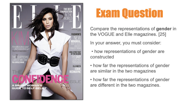
 one is using direct address where as the other isn't
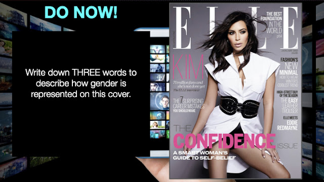
One is a medium close up where as the other is a medium long shotboth are wearing expensive looking clothes
both front covers talk about stereotypical feminine topics
both wearing expensive looking jewellery
Malala is wearing a head scarf to represent religion whereas Kim doesn't show any signs of religion
The two magazine represents the different ways of how females can be represented.
However, these two covers have similar representations of women by the choice of jewellery, this is because most women on front covers have very expensive looking jewellery always shown weather it be rings, earrings, necklaces, bracelets, etc. This is an example of this because both Malala and Kim Kardashian are wearing rings and they look quite expensive which could be a link to wealth and probably that they get paid quite handsomely with what they do in life.
Another similarity both of these front covers share is what the front covers talk about, the cover lines in both magazine cover quite feminine topics, this is because the creators of the magazine intended for only females/ women to read hence why it mentions common stereotypical topics that women are portrayed to like. For example, the cover line 'Love after lockdown' the word 'love' is a very stereotypical feminine topic on the Vogue cover. On the Elle cover the cover line that states 'Fashions new minimal' Fashion is a very common stereotype for women to have a liking towards.
However, a difference between these 2 covers is that Malala, in the vogue cover, is wearing a headscarf to represent her religion she is apart of, whereas Kim Kardashian doesn't show any form of representation of religion, this could be because she doesn't wish to show a part of her religion or she isn't a religious person and isn't apart of any religion.
Similarly, another difference is the different shot types contrasting between the two of the covers. The Malala front cover is using a medium close up to show light on her face and her head this creates the effect of Malalas brain instead of her body and is shown as a person and not as an object, whereas on the Elle cover, they are using a medium long shot to create emphasis on her body this also creates an affect on her body as an object for people to look at and not as a person.
In conclusion, both representations of women are both similar and different but in my opinion they are very different but they have been constructed similarly with the use of media language in both of these covers.
9/12/2023
Dirt
15/25
Good work!
WWW: some good comparisons and analysis of both products with accurate terminology
EBI: You last few paragraphs were too vague - you need to make sure that you are explaining your examples fully - what do those elements connote/how do they link to representation?






MAG REPRESENTATION EXAM Q:
ReplyDeleteA good start.
WWW: you've compared both covers and included gender stereotypes
EBI: include more specific media terminology in your examples
HOMEWORK - GQ COVER
ReplyDeleteNot completed - needs doing please
GQ/VOGUE RESEARCH:
Good
GQ/RS RESEARCH & NOTES:
ReplyDeleteGood - solid notes
GQ COVER ANALYSIS:
Absent
GQ EXAM Q:
WWW: detailed, thorough & accurate use of terminology
EBI: link to GQ audience, genre & ideologies more where possible
REP HWK:
Missing??
REP HWK:
ReplyDeleteA good comparison - we're going to do more on this in class.
VOQUE COVER NOTES:
Good but some missing.
VOGUE COVER MEDIA LANGUAGE:
Some good analysis
VOQUE ML HWK:
WWW: Good ideas with specific details to support
EBI: Can we change 'girly' to 'stereotypically female'? Also - are they ALL girly??
VOGUE REP NOTES:
Not good enough - you need to complete this please.
VOGUE EXAM COMPARISON Q
15/25
Good work!
WWW: some good comparisons and analysis of both products with accurate terminology
EBI: You last few paragraphs were too vague - you need to make sure that you are explaining your examples fully - what do those elements connote/how do they link to representation?