Posts

in-design

Image
Tuesday 11h July 2023 In-design LO: to explore and understand ow to use InDesign for magazine covers. Thursday 13th July 2023 Magazine design lo: to create an effective magazine cover using appropriate codes and conventions

masthead design

Image
 Tuesday 4th July 2023 1) cooking/baking 2) pasta 3) pasta.

Adobe illustrator

Image
 Tuesday 27th June 2023 Adobe illustrator Lo: Explore the use of Adobe illustrator to create a magazine masthead or logo.

Magazine front covers

Image
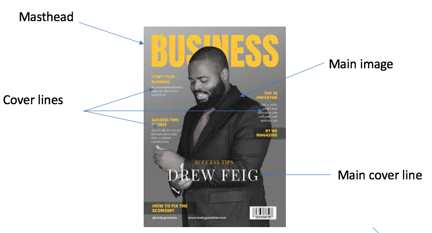
 Thursday 15th June 2023 Magazine front cover LO:  To identify the features on a magazine front cover; to explore genre codes and conventions Masthead: at the top of the page Dateline: first line Main image: in the middle Cover lines: on the side Main cover line: on the side Bar code\price: the bottom Tagline\Strapline: at bottom near logo short description of the titles main marketing points Pull quote: next to the content Tuesday 20th June 2023 lo:  To identify the features on a magazine front cover; to explore genre codes and conventions. Sports magazines What they have in common: there all sports they all shows someone who does the sports Sub genre pop rock heavy metal blues country hip hop electronic jazz hardcore punk contemporary folk rap blues: Cooking/ food: Colour palette: Bright and dark colours depending on the dish to bring out the dish on the cover. Main images: The food that is being made on the inside of the magazine. Typography: Capital letters in ever letter. Cover li

website evaluation

Image
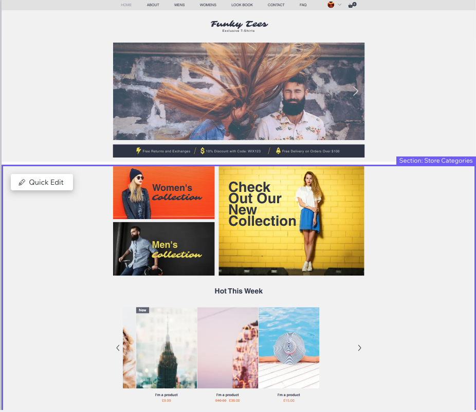
 https://finnbreslin14.wixsite.com/my-site My website is a clothing brand for both male and females. My website also includes sports wear such as football shirts and shorts etc.  The things i had to do to create my website is I had to find the correct template that showed an example of a piece of clothing for women and men. Preferable, I had to find a template to show off the newest shirt design so the people visiting would now some examples of what type of clothing we would sell, then  had to find the correct images and sizes to fit inside the box provided from the template. I also had to change all of the text to fit the description of the images used. I am pleased with the 'about' section of my website as i think it well describes my website and what it provides along side it. I would change how thorough I am with the designs used and the amount of designs because some images on the home page doesn't show a wide variety of clothes in the website.

Wix website

Image
 Thursday 25th May 2023

Brand design

Image
 Tuesday 23rd may 2023